
Status Details
The timeline behind Realtime status: every monitor of a product, bucket by bucket, with grouping, filters, and a TV mode.
Realtime status answers one question: is everything healthy right now. Status Details answers the next one: what happened, monitor by monitor, over a period. One row per monitor and one cell per time bucket, so the shape of an incident (which monitors, which zone, how long) is readable at a glance.
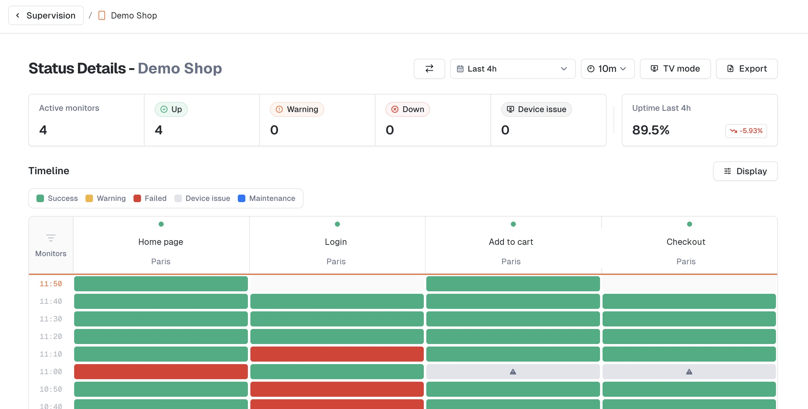
Open the page
Click a card's name in Realtime status. The click carries what you were looking at: the time range, the aggregation, and the test when the view is grouped by test. Use the breadcrumb at the top to switch product without leaving the page.
The page opens on the last 12 hours with a 10-minute aggregation, and folds the navigation sidebar to give the timeline the full width. Your own sidebar preference is restored when you leave.
Read the timeline
Each cell covers one monitor over one bucket, colored by the worst status in that bucket:
- Success, Warning, Failed, Device issue, and Maintenance. Turn the Legend on from the Display menu to keep the color key on screen.
- Buckets with no run show as empty, with "No execution" in the tooltip.
- The bucket in progress shows a pending state until its results land.
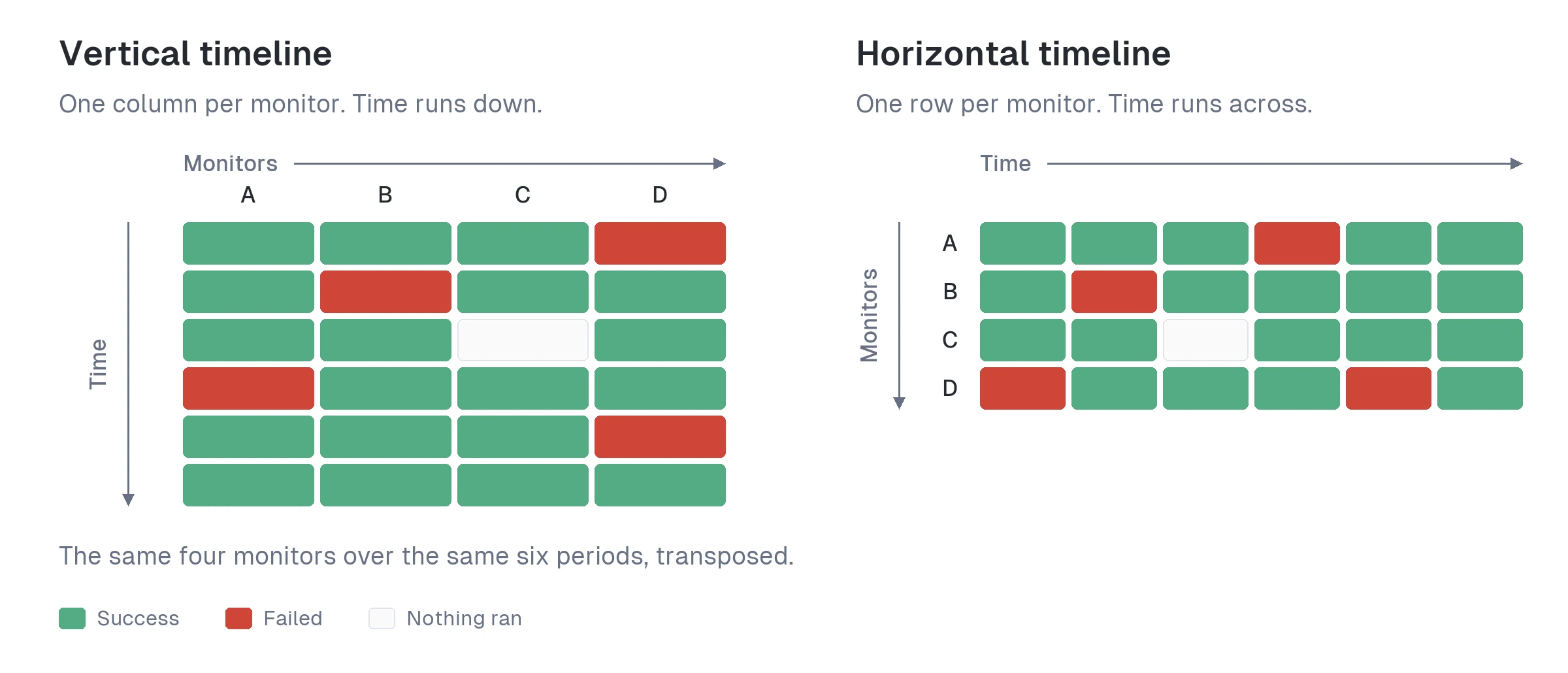
Two orientations, switched from the Display menu:
- Vertical timeline (the default): monitors as columns, time running down the page. This is the one that fits the most monitors on screen.
- Horizontal timeline: monitors as rows, time running across.
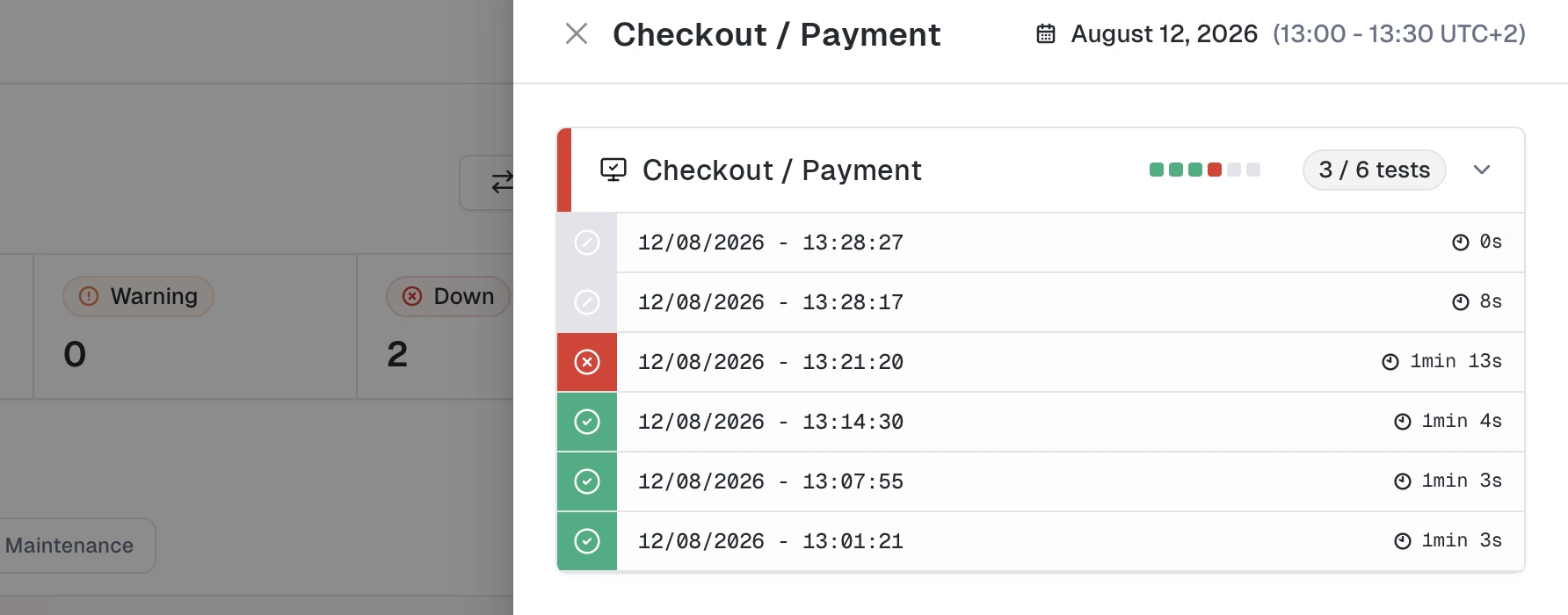
What a click does:
- A cell holding a single execution opens that result directly.
- A cell holding several executions opens a drawer listing the bucket's runs.
- A monitor's name opens the monitor details page.
Drag the edge of the Monitors column to widen it when names are truncated. Group labels and the table header stay pinned while you scroll.
On the vertical timeline, the columns narrow themselves when the monitors would not otherwise fit the window width. There is no density setting to manage.
Time range and aggregation
The time range picker offers presets from the last 2 hours to the last 12 months, or a custom start and end. The aggregation select next to it sets the bucket size; the values on offer depend on the range, since the finest aggregations produce unreadable tables over long periods.
At the end of the timeline, Load more data extends the range to the next wider preset, up to the last 12 months. It is the quickest way to go from "this morning" to "this week" without touching the picker.
Display options
The Display menu holds everything about how the table reads:
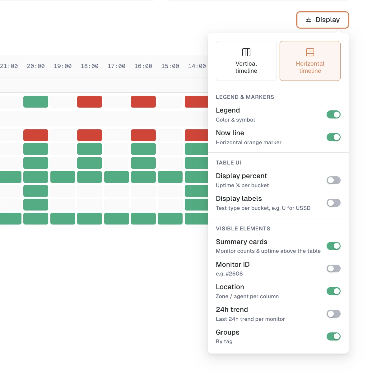
| Section | Option | What it does |
|---|---|---|
| Orientation | Vertical / Horizontal timeline | Monitors as columns or as rows |
| Legend & markers | Legend | Show the color and symbol key |
| Legend & markers | Now line | Orange marker on the current time |
| Table UI | Display percent | Uptime percentage inside each bucket |
| Table UI | Display labels | Test type inside each bucket, such as U for USSD |
| Visible elements | Summary cards | Monitor counts and uptime above the table |
| Visible elements | Monitor ID | The monitor's ID next to its name |
| Visible elements | Location | The zone or agent of each monitor |
| Visible elements | 24h trend | A last-24h trend per monitor |
| Grouping | Group by tag | One band per tag, available once monitors are tagged |
| Grouping | Group by location | One band per zone |
Display percent and Display labels compete for the same space inside a cell, so turning one on turns the other off.
Out of the box: vertical timeline, grouped by tag, Location and Now line on, everything else off. The page opens on the timeline rather than on summary cards, which is what you want when you are watching a live incident.
Filter what you watch
The Filter menu narrows the monitors on screen by Test, Location, Tags, and Status. Test, Location, and Tags are searchable, so a product with a hundred monitors is still workable. Reset clears everything at once.
Filters are remembered per product, so coming back to a product finds the monitors you were watching.
Keep and share a view
Your display options, sort, aggregation, and filters are kept between visits, and the page's URL carries them too. Copy the URL and whoever opens it sees the same table, same range, same grouping. It makes a solid link to paste in a ticket or a runbook.
TV mode
TV mode turns the page into a wall display: navigation and page header disappear, and the timeline takes the whole window. The top bar keeps a day/night switch and the way out.
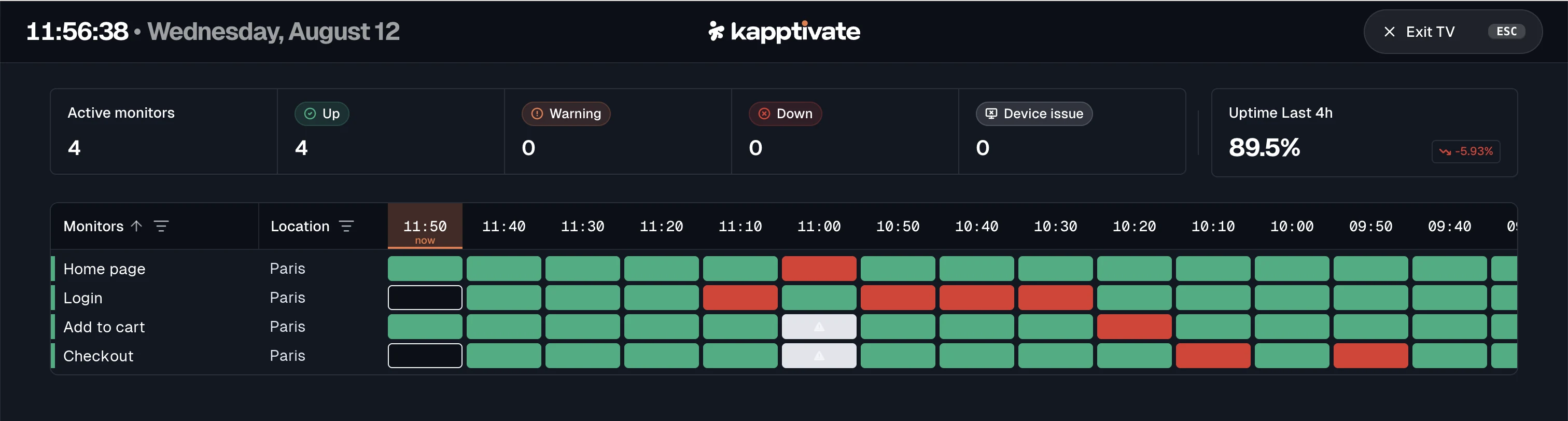
It no longer takes over the screen, so two browser windows side by side can watch two products at once.
Export
Export downloads the current range and aggregation as a CSV, one row per monitor and bucket, for the analysis that belongs in a spreadsheet.
The page that Status Details replaces is still reachable at /overview/legacy, with a banner pointing to the new one. It is scheduled for removal on September 8, 2026. See Where did the Overview page go?.
What's next?
Last updated on